How to build a fishbone (Ishikawa) diagram in PowerPoint when each 4M category turns up a different number of causes, without cramped or empty bones.
How many causes did your last root-cause workshop actually turn up under Machine — two, or six? PowerPoint has no built-in fishbone template, so most guides tell you to draw the spine and four category bones as identical, evenly spaced branches and fill in causes as you go. That works fine in the demo, where every category conveniently gets three causes. It falls apart the moment a real workshop hands you six causes for Machine and two for Man, because a bone built to a fixed length either crowds six labels on top of each other or leaves a two-cause bone with an awkward gap where a third label was supposed to go. The fix is to size each bone's length — and the spacing between its cause ticks — to that category's actual cause count, not to a template default.
The 4M set — Man, Machine, Method, Material — is the manufacturing default, but it's a convention, not a rule; service teams often swap in the 4S set (Surroundings, Suppliers, Systems, Skills), and marketing root-cause work sometimes stretches to 8P. Whichever category set fits the problem, the layout issue is identical: nothing about picking the "right" categories tells you in advance how many causes will land under each one, and that count is what actually drives the layout, not the category label.
The Draft That Looked Fine Until the Causes Went In
Picture a manufacturing quality team two hours into a defect-rate root-cause session, using the standard 4M categories — Man, Machine, Method, Material. Someone opens PowerPoint, draws a horizontal spine with an arrowhead pointing at a "Defect Rate ↑" box, and adds four diagonal bones off the spine, evenly spaced, all the same length, because that's what the fishbone templates everyone has seen look like. The workshop then does its actual job: sticky notes turn into typed causes, and they land unevenly, the way root causes always do. Machine ends up with six: worn tooling, uncalibrated sensor, inconsistent line speed, coolant contamination, misaligned fixture, and aging PLC firmware. Man gets two: new-hire training gap and shift-handover checklist skipped. Method gets four, Material gets three.
Typed onto the fixed-length bones from the template, Machine's six causes either get crammed into a bone sized for three — tiny font, labels overlapping the tick marks — or someone starts abbreviating causes into fragments that no longer mean anything to a reader who wasn't in the room. Man's two causes, on the same fixed length, float with a wide gap where the diagram visually implies a third cause exists and simply wasn't found yet. Neither read is accurate. The diagram is reporting the template's assumptions about cause counts, not the workshop's actual output.
What's Actually Wrong With Fixed-Length Bones
The root issue is that a fishbone diagram is doing two jobs that pull in different directions once real content goes in. It has to look symmetric enough to read as "the same kind of analysis applied to four categories" — that's what the classic herringbone shape signals at a glance. And it has to represent an honest count of causes per category, which is almost never symmetric in practice. A template solves the first job by fixing bone length before anyone knows the second. That's backwards: bone length is exactly the variable that should flex to match cause count, the same way a table's row height should flex to match how many rows of content actually exist in it.
There's a second, quieter problem with fixed-length bones: tick spacing. Even if you resize a bone to fit six labels without literal overlap, cramming six ticks into a length built for three means the ticks themselves sit closer together than the ticks on a lightly populated bone. That inconsistency is what makes a finished fishbone diagram look hand-assembled rather than analyzed — a reviewer's eye catches the uneven density even before reading a single cause label, and it reads as sloppiness even when the underlying analysis was careful.
It's worth being honest about why this keeps happening even to teams who know better: a fishbone diagram is usually built live, during or right after a workshop, under time pressure to get something onto a slide before the next meeting. Fixed-length bones are faster to draw in the moment — you don't have to decide anything about proportions, you just copy the same shape four times and move on. The cost of that shortcut doesn't show up until someone tries to actually read the finished diagram, which is exactly the gap between "fast to produce" and "fast to understand" that a lot of slide-formatting shortcuts fall into.
Building a Fishbone Diagram in PowerPoint, Step by Step
Here's the sequence that produces a diagram that still looks intentional once real cause counts go in:
- Finish the root-cause workshop and count causes per category before opening PowerPoint. Write down the actual number for Man, Machine, Method, and Material. Common mistake: building the spine-and-bones skeleton first "to have something to fill in," which locks in a bone length before anyone knows whether a category needs two causes or six.
- Draw the spine as a single straight line with an arrowhead, using Insert > Shapes > Line, not a SmartArt Cause & Effect graphic. SmartArt's fishbone-style layout fixes both bone count and roughly equal bone proportions, with no clean way to make one bone twice as long as another. Common mistake: starting from SmartArt because it's the fastest way to get something on the slide — it's also the reason so many fishbone diagrams online look identical regardless of what data they're supposedly showing.
- Set each bone's length proportional to its cause count, not to a fixed default. A reasonable starting rule: roughly 20–25 points of bone length per cause, so a six-cause Machine bone runs noticeably longer than a two-cause Man bone. Common mistake: eyeballing "long enough" bone lengths without a rule, which tends to regress back toward equal lengths because that's what a fishbone diagram is "supposed" to look like in your head.
- Attach cause labels as small tick marks along each bone at a consistent spacing — not stretched or squeezed to fill the bone's length. Pick one spacing value (for example, 24 points between ticks) and apply it to every bone; the bone's total length is a consequence of tick count times that spacing, not the other way around. Common mistake: spacing ticks evenly across whatever length the bone happens to be, which is exactly how a three-cause bone and a six-cause bone end up with different, inconsistent tick densities.
- Alternate bones above and below the spine in attachment order, not by category importance. The classic herringbone alternation (first category above, second below, third above, fourth below) is a readability convention, not a ranking — attaching the two busiest categories on the same side just because they "matter more" tends to crowd one half of the diagram. Common mistake: grouping bones by perceived importance rather than alternating, which unbalances the whole diagram visually regardless of how well-sized each individual bone is.
- Label the problem box last, after the spine length is set. Insert a rectangle at the spine's arrowhead end sized to the actual problem statement's text length. Common mistake: sizing the problem box first and then discovering the spine has to stretch or shrink to reach it once the bones on the left are finalized.
- Group bones and spine as separate objects from the cause-tick labels. This matters the next time a workshop adds a seventh cause to Machine: ungrouping to insert one more tick without disturbing the other three bones' alignment is a five-second edit if they were never one giant group, and a full realignment pass if they were.
- Split a bone into two levels once a category passes about seven or eight causes. A single bone with eight-plus ticks stops reading as "several distinct causes" and starts reading as a bulleted list that happens to be tilted. Group the causes into two or three sub-clusters instead — for example, splitting a nine-cause Machine bone into "calibration-related" and "wear-related" sub-bones branching off the main one — rather than lengthening one bone indefinitely. Common mistake: treating bone length as infinitely elastic and just making an overloaded bone longer and longer — past a point, a longer bone with more causes is harder to scan than two shorter, grouped ones, even though both technically still fit on the slide.
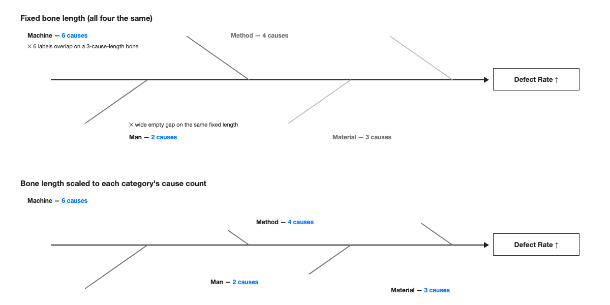
Field note: the first fishbone diagram I built at a global consulting firm for a client's defect-rate review had all four bones locked to the same length because that's what the firm's template shipped with. Machine's six causes got compressed to 8-point labels running into each other; a partner circled the whole bone in the print review and wrote "illegible" without further comment. The fix that actually shipped wasn't a font change — it was letting Machine's bone run about twice as long as Man's, which is what the cause count had been saying the whole time. The rebuild took maybe fifteen minutes once someone stopped trying to preserve the template's four equal bones and just measured what six real causes actually needed.
The Same Fix Applied to a Different Root-Cause Exercise
The same principle carries over cleanly to a 6M version of the same diagram — Man, Machine, Method, Material, Measurement, Mother Nature (environment) — which shows up often in manufacturing and process-improvement work once a team wants to separate measurement-system error from the other four categories. Adding a fifth and sixth bone to a diagram that was built with fixed-length, evenly spaced bones means resizing all six from scratch, because the spine now needs six attachment points instead of four and the old spacing math no longer holds. Built with the length-per-cause-count rule from the start, adding Measurement and Mother Nature bones is additive: each new bone gets its own length based on its own cause count, and the existing four don't need to move.
It also transfers to problem trees and fault trees, where the same instinct — force every branch to the same length "for symmetry" — produces the identical failure mode: branches with more sub-causes get compressed, and branches with fewer look unfinished. Any diagram built as a central spine or node with variable-length branches benefits from the same rule: let branch length be a function of content, decided after the content exists, not before.
The 5 Whys technique that often follows a fishbone session is a useful stress test for whether the underlying rule was actually applied, rather than just eyeballed. Once the team picks the two or three causes worth chasing further — say, "uncalibrated sensor" and "aging PLC firmware" from the Machine bone — each one typically unpacks into its own three-to-five-step chain of "why" before landing on a root cause. Trying to force those chains onto the original fishbone diagram, at the original bone length, is what causes the most common breakdown in practice: teams either abandon the fishbone format entirely once 5 Whys starts, or try to cram a five-step chain into the same tick spacing used for a single-word cause label. Treating the 5 Whys chain as its own small branching diagram — same length-per-item rule, applied to a chain instead of a bone — keeps the two exercises visually consistent instead of switching formats halfway through the analysis.
Where AI Closes the Bone-Length Gap
Because the number of causes per category is exactly the thing that's unknown until the workshop actually happens, this is one of the places an AI layout tool inside PowerPoint earns its place rather than just looking neat in a demo. Give Advisio the spine, the category names, and each category's cause list, and it sizes every bone's length and tick spacing to that category's actual cause count instead of forcing a uniform template — a six-cause Machine bone and a two-cause Man bone both come out legible, and adding a seventh cause after the fact doesn't mean realigning the other three bones by hand. It's listed on Microsoft AppSource, and because it builds the diagram as native, editable PowerPoint shapes rather than a flattened image, the next workshop's revision is still a normal click-and-type edit.
Five Principles for Any Branching Diagram, Not Just Fishbone
- Count before you draw. Whatever the categories are, know how many items go in each one before you fix any shape's size — the same rule that keeps a MECE issue tree from needing a full rebuild every time a branch gains a sub-point.
- Size the container to the content, never the reverse. A branch, a bone, a table row, or a quadrant should all be sized after you know what's going inside them, not before.
- Keep one spacing rule and let total length follow from it. Consistent spacing between items reads as "analyzed"; consistent total length with inconsistent spacing reads as "assembled to fit a template."
- Reserve visual symmetry for structure, not for content volume. The herringbone alternation, the four-quadrant layout, the tree's branch angles — these should stay symmetric. The amount of content inside each symmetric slot should not be forced to match.
- Group structural elements separately from content elements. Spine and bones as one group, cause labels as another, means the next revision touches only the group that actually changed.