10 core consulting slide templates (issue tree, 2x2, waterfall, Gantt, RACI, and more) plus the alignment and formatting pass that closes the gap between "template" and McKinsey-grade.
The 10 slide templates every consulting deck is built from are: the executive summary, the issue tree, the 2x2 matrix, the waterfall (bridge) chart, the roadmap/Gantt, the RACI matrix, the process flow, the comparison table, the "so-what" chart page, and the appendix/backup slide. Downloading these won't get you a McKinsey-looking deck on its own — the templates give you a shape to pour content into, but the thing that actually reads as "consulting-grade" is the alignment, spacing, and font discipline applied after you fill them in. That second part is the one almost nobody explains.
I learned this the slow way. At a Big Four firm, my first few decks used the same templates as everyone around me — the firm had a whole shared library of them — and they still looked like a first-year associate had made them. The templates were never the problem. What was missing was a fixed set of formatting habits I didn't yet have: one grid, one type scale, one spacing rule, applied without exception across every slide.
What are the 10 core consulting slide templates?
Every consulting deck, regardless of firm or industry, is assembled from a small set of recurring slide shapes. Once you can recognize which shape a message needs, building the slide is mostly mechanical.
| Template | When to use it | Where it breaks in practice |
|---|---|---|
| Executive summary | Opening page, 3-5 headline findings | Bullets left at uneven indent levels and line counts |
| Issue tree | Breaking a question into MECE sub-questions | Branches and connectors not evenly spaced when one branch changes |
| 2x2 matrix | Positioning options or segments on two axes | Bubble or label overlap when items cluster near the same spot |
| Waterfall / bridge chart | Explaining a change from a starting to an ending number | Connector lines not touching the bar edges exactly |
| Roadmap / Gantt | Showing a timeline of workstreams and milestones | Bars misaligned to the week/month grid after edits |
| RACI matrix | Assigning roles across workstreams or decisions | Cell colors and legend inconsistent slide to slide |
| Process flow | Walking through a sequence of steps or a workflow | Arrow lengths and box widths that don't match |
| Comparison table | Comparing options, vendors, or scenarios feature by feature | Row heights that grow unevenly as text wraps |
| "So-what" chart page | One chart plus an action title stating the takeaway | Chart plotted before the title is finalized, so they disagree |
| Appendix / backup | Supporting detail moved out of the main storyline | Backup slides skip the formatting pass entirely |
Where can you find free consulting-style templates?
You don't need to reverse-engineer these from scratch. Free libraries of McKinsey-, BCG-, and Bain-style layouts are easy to find — sites like SlidesCarnival and 24Slides publish free McKinsey-style PowerPoint decks, and paid libraries such as Deckary bundle dozens of consulting-grade layouts built around the same 10 shapes above. Any of these will get you a reasonable starting shape for an executive summary, a 2x2, or a roadmap slide.
The catch is what happens next. A template file gives you placeholder boxes sized for placeholder text. The moment you paste in your own numbers, your own company names, and a bullet that's four words longer than the placeholder, the box resizes, the alignment that looked clean in the preview shifts, and nothing lines up with the slide next to it anymore.
What makes a consulting-grade deck look different from a templated one?
The difference isn't the template — it's whether the same formatting rules were applied without exception across every single slide. Three things do almost all of the work:
- One shared grid. Every title starts at the same x-position, every content zone starts at the same y-position, and every slide uses the same margins. If you're building free-hand, turn on PowerPoint's alignment guides (View → Guides) and snap every object to them — don't eyeball it.
- One type scale. Titles are one size, action titles are one size, body text is one size, footnotes are one size — used identically on every slide, not adjusted slide by slide so a longer sentence fits.
- One spacing rhythm. The gap between a chart and its footnote, between a title and the content below it, and between bullet lines should be the same measurement everywhere, not "whatever looked okay when I dragged it."
A free template gives you the first draft of the grid. It cannot enforce that grid once you start editing — that enforcement is a separate, manual pass, and it's the pass most people skip because a 40-slide deck due at 9am doesn't leave room for it.
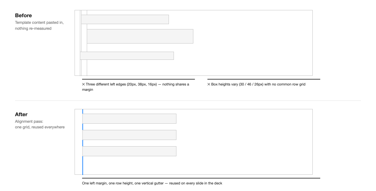
Before/after: turning a templated slide into a consulting-grade one
Here's a concrete pass on a typical executive summary slide built from a free template:
- Before: Three findings pasted in as bullets. Bullet 1 wraps to two lines and sits 0.2 inches left of bullets 2 and 3 because it was typed directly into the placeholder while the others were pasted from Word. Font sizes read 18pt, 17pt, and 18pt because PowerPoint auto-shrank one box to fit.
- After: All three boxes are resized to the same width and re-anchored to a single left edge using Align Left (Home → Arrange → Align → Align Left) with all three boxes selected together. Font is locked to 17pt across all three, and AutoFit is turned off (right-click box → Format Shape → Text Options → "Do not autofit") so the size can't silently drift again.
- Before: A title case action title — "Revenue Growth Overview" — that describes the topic but not the finding.
- After: A full-sentence action title — "Revenue grew 12% in Q3, driven mainly by the EMEA region" — that states the actual takeaway, matching what the chart below it shows.
None of this required a better template. It required going back through a finished slide with an editor's eye, which is the step a template file can never do for you.
Is it faster to build from a template or from scratch?
Starting from a template is almost always faster for the first draft — you're not deciding layout from zero. But the formatting pass afterward tends to take longer than people expect, because you're now fighting the template's defaults rather than building your own from the start. Teams that produce a lot of client decks usually solve this by maintaining an internal master template with the grid, type scale, and spacing already locked, so the alignment pass is mostly done before anyone starts typing.
This is also the gap Advisio is built to close for teams that don't have an internal template team keeping that discipline. It's a PowerPoint add-in, listed on Microsoft AppSource, that generates slides directly inside PowerPoint using the same 10 shapes above — with the grid, spacing, and type scale applied automatically rather than left for someone to fix at 11pm. You still supply the content and the storyline; the layout work that usually eats the evening happens as the slide is generated.
If you're earlier in the process and still nailing down the underlying narrative, our step-by-step guide to building consulting slides covers the storyline and action-title work that comes before any template gets touched.
FAQ
Are free McKinsey-style PowerPoint templates actually usable for client work?
As a starting shape, yes — they save you from designing a 2x2 or a roadmap layout from a blank slide. But most free templates use generic sample text and placeholder-sized boxes, so plan on a full alignment and font pass before anything goes to a client. Skipping that pass is the single most common reason a "McKinsey template" deck still doesn't look like a McKinsey deck.
What's the difference between a topic title and an action title on a consulting slide?
A topic title names the subject ("Revenue by Region"). An action title states the finding as a full sentence ("EMEA revenue grew 12% while APAC declined 4%"). Consulting decks lead with action titles because the title itself should carry the message, even if the reader never looks at the chart.
How many fonts should a consulting deck use?
One, in two or three weights (regular, semibold, bold) for headings versus body text. Two fonts is sometimes acceptable if one is reserved strictly for section dividers. Three or more is a visible tell that the deck was assembled by multiple people without a shared template.
What's the fastest way to fix alignment across an entire deck?
Select all objects of the same type across a slide (titles, then content boxes, then footnotes) and use PowerPoint's Align Left/Align Top tools rather than dragging by eye. For recurring elements like footnotes or page numbers, set their position once on the slide master so every new slide inherits it automatically.
Do I need think-cell or a paid add-in to hit consulting-grade formatting?
No — native PowerPoint alignment guides, the slide master, and disciplined use of Align/Distribute tools get most decks there. Paid add-ins like think-cell mainly save time on chart types (waterfalls, Gantt bars) that are tedious to build natively, not on the alignment discipline itself.